Launching and optimizing a subscription model for a startup B corp
My work directly contributed to over $3 million from increased average revenue per customer and 98% month-over-month customer retention. The social impact was millions of pounds of waste diverted from landfills.
First step!
Understanding the pre-existing experience
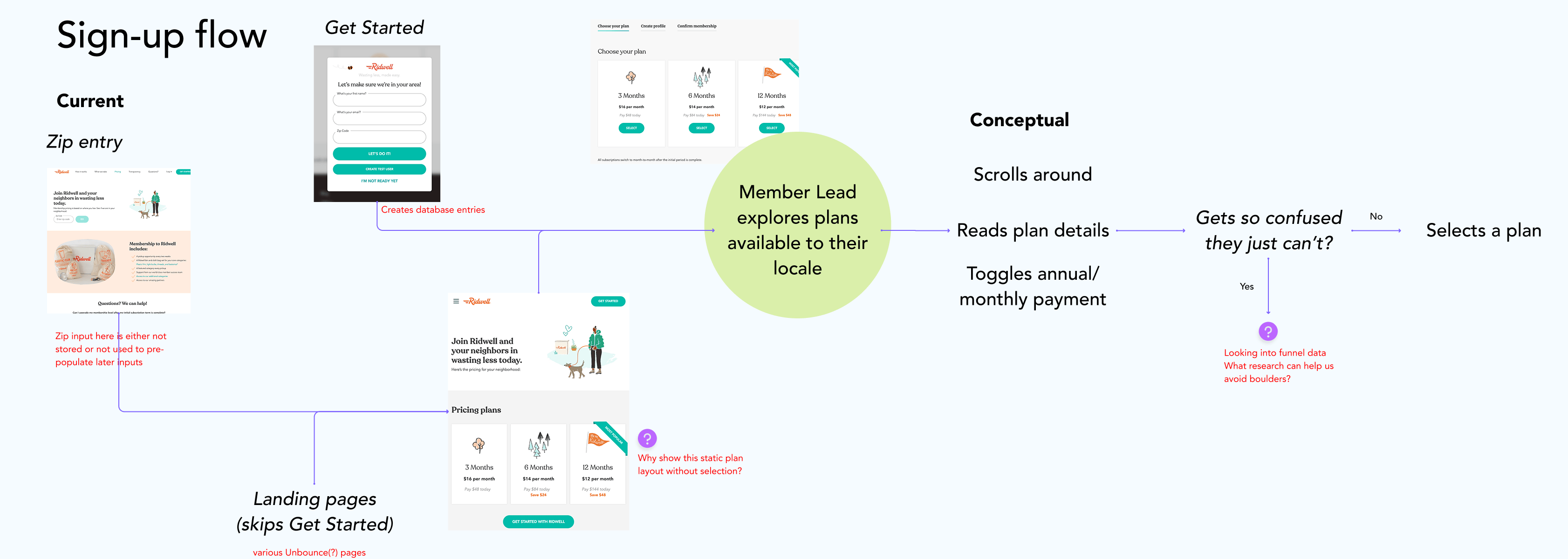
I hit the ground running on this project, my first at Ridwell. Leadership had already defined a new subscription model they planned to launch to ~90,000 customers in four months. I spoke with co-founders, customer success specialists, engineers, and customers. I tore down the existing designs with heuristic evaluation. All this helped me understand what Ridwell customers experienced with the existing service, how to improve design quality, and what business stakeholders hoped to achieve. Diagrams like the one above, with flows, screenshots, and my critical notes helped me craft a vision for how to shape the new subscription model with care for both business and customer needs.
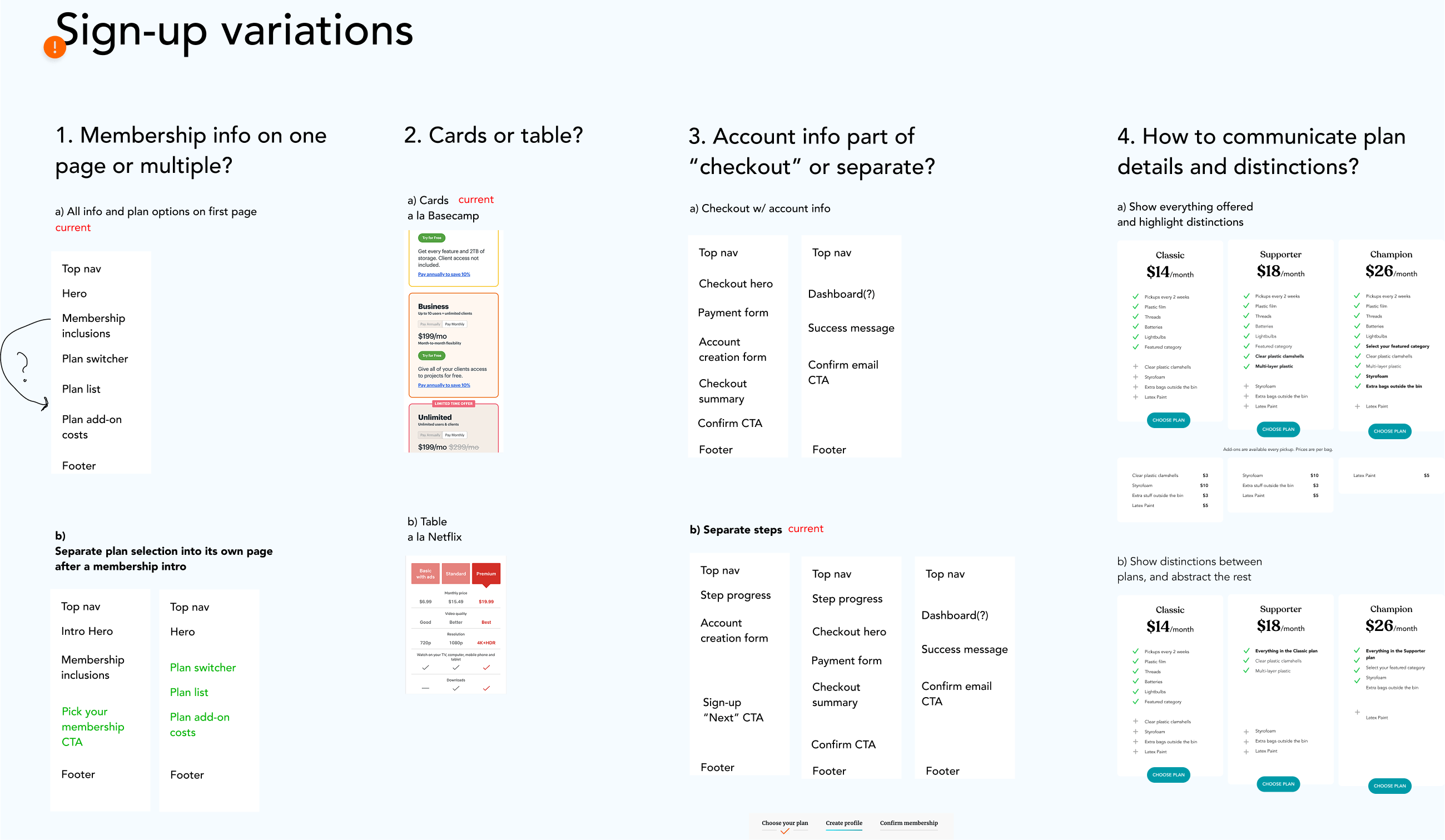
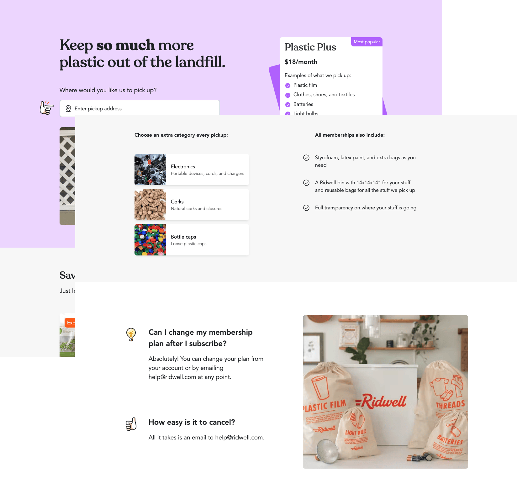
Exploring how to present the new subscription model
- Reviewing existing interaction patterns for inspiration
- Translating a recent mobile UI design system into responsive web app patterns
- Regular coordination with engineers and a product manager (sprint planning, pairing sessions, retrospectives)
- Evaluative UX research to increase our confidence in concepts and remove potential usability boulders from our soon-to-be customer experience
Leading up to launch, my work involved:
Design challenges and decisions
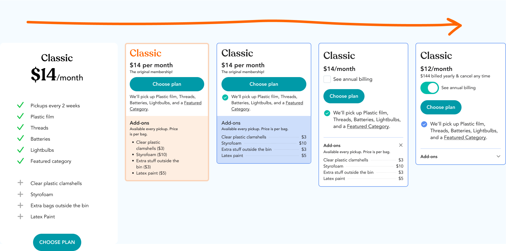
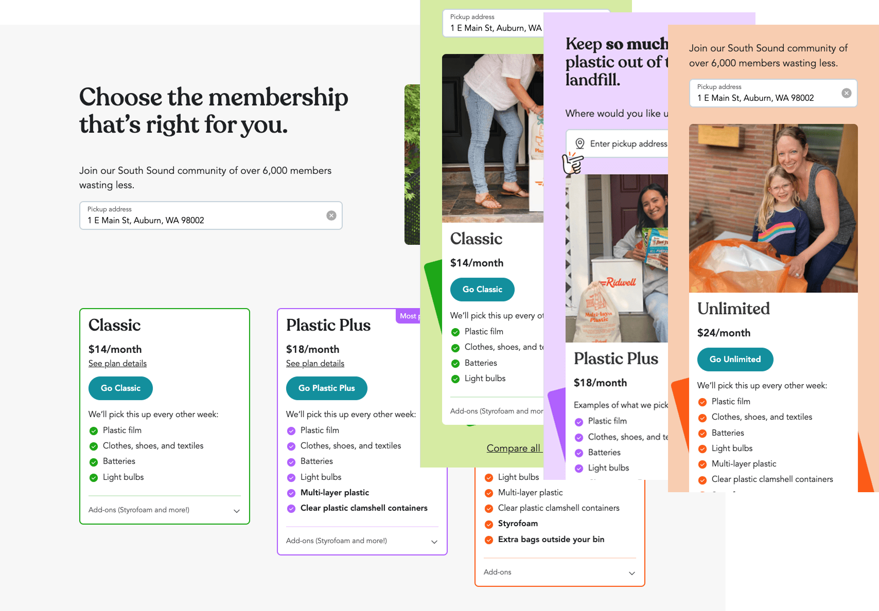
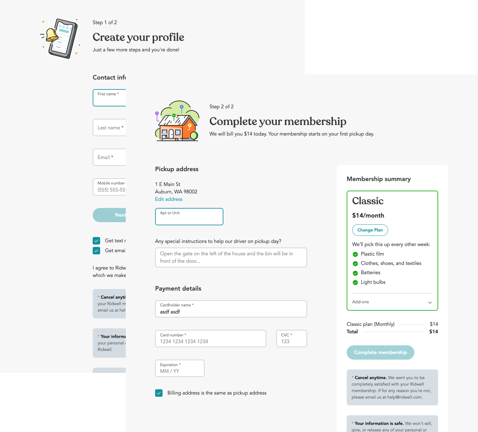
Prototypes, research, teammate feedback, inspiration, and intuition guided my decisions on how to structure content and navigation that affords Ridwell leads to make a clear decision easily. Some of the leadership team expressed anxiety about the experience overwhelming people and feeling too transactional. Since the company had started as a community service between neighbors, the vision for how how people sign up for Ridwell held true to a personable, community member tone. Because of this, I decided to limit information density in both how we lay out content and by separating account creation and checkout into separate steps. I also decided to present the plans as cards, instead of a table, to provide a visual metaphor of something tangible rather than purely analytical.
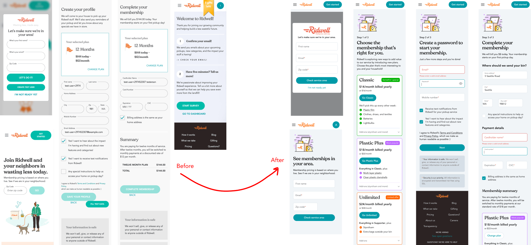
Redesigning the subscription experience using a new visual language provided opportunities to improve accessibility and maintainability in the codebase.
Launch and beyond
- Tracking user experience via funnels to identify major opportunities to optimize
- Running research studies to gather qualitative insight into major opportunities
- Working with product management, marketing, engineering, and customer success to define experiments to improve the subscription experience
After launch, my work involved:
Iteration challenges and decisions
A ha! A few weeks after launch, thanks to user interviews I facilitated, we learned that people want to know how big the Ridwell bin is and how easy it is to change or cancel their plan after they sign up. My product manager and a co-founder expressed concern about telling people how easy it is to cancel. Won’t this reduce retention? They were attracted to the idea of making it difficult to cancel, of obfuscating this information. Given my research, and examples of subscription services that make a benefit of easy plan switching, pausing, or canceling, I convinced the team to test out a low-effort solution. We added a few lines of copy. Customer retention didn’t drop at all, and subscription conversion steadily increased in the next several months.
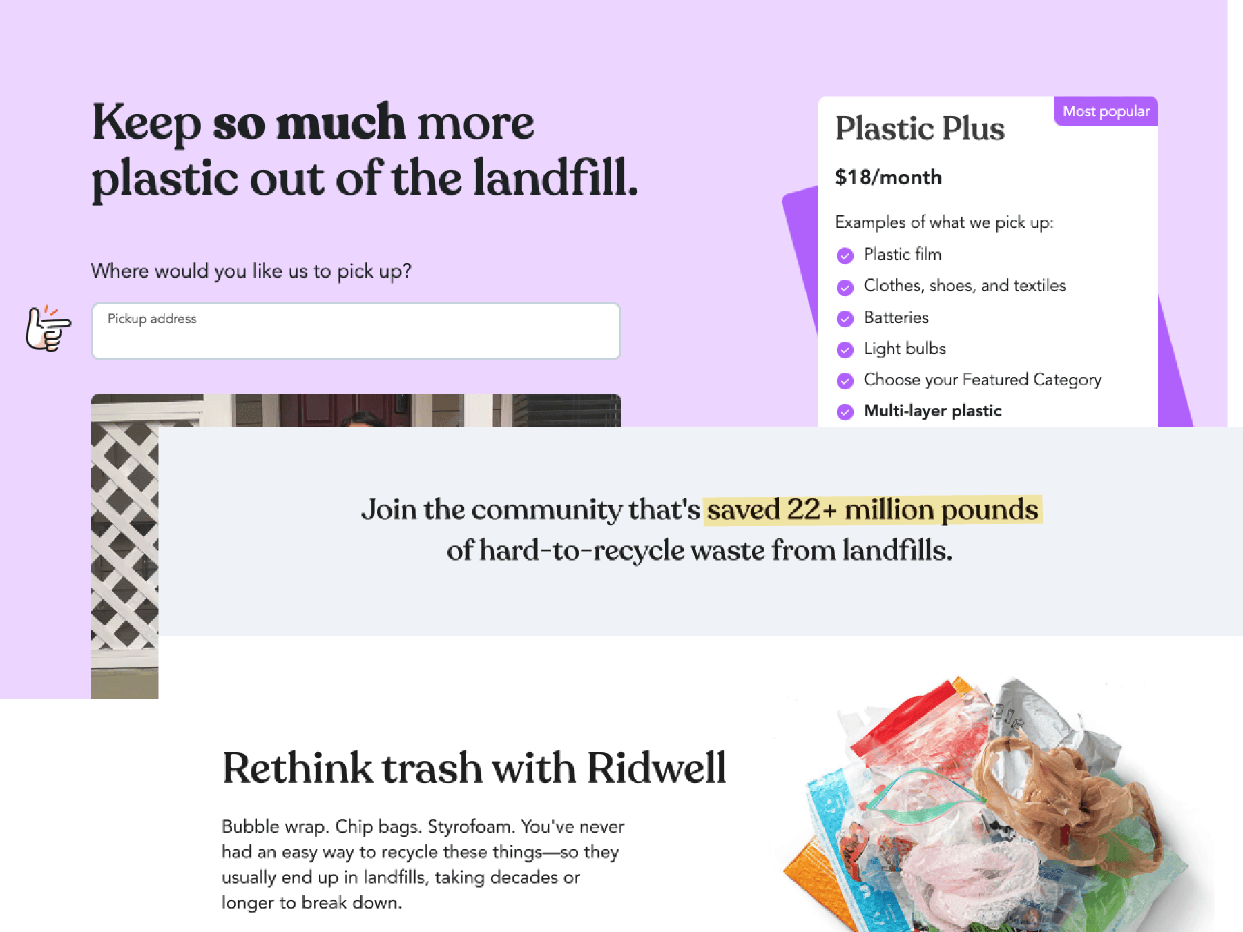
See my work on the site: ridwell.com/plans/plastic-plus